Last week I was lucky enough to be able to go to the 2013 Atlanta Designer’s Show House. I say lucky because 1) Phil let me spend $25 on a ticket, 2) Phil let me pay a babysitter, and 3) it is only about 10 minutes away from my house. People travel a long way to see this thing so it was fun to be a local. I do realize it sounds like I am married to a stingy ogre, but let me set the scene. This month, we travel to Seattle for ten days (plane tickets, eating out every meal, hotel) and then to Orlando for another seven (plane tickets, eating out every meal, hotel). So it is a tight month, and $50 for an afternoon alone was a high cost. So really, I am married to an angel who knows how important this was to me and how much I needed an afternoon alone.
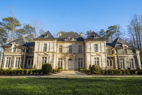
This year’s show house is an 18,000 square foot house called Tuffeau. It was designed by William T. Baker, a renowned Atlantan architect. The architecture is based on of french design, with zinc dormers, a slate roof and French limestone.
The Design House Association comes out with a publication each year featuring the rooms (which I will be requesting for Christmas), so there was no photography allowed because of publication rights. Of course part of me wants to inundate this post with pictures, but part of me is glad I was able to just enjoy the house without stopping every five seconds to snap a shot. I will post some pictures that are on their website, however.
In an 18,000 square house, suffice to say there were too many amazing things to mention. But here is a list of the highlights of things I loved or new products I saw.
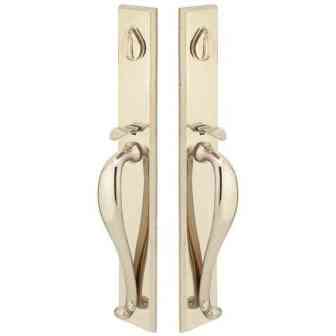
1. White bronze – This metal looks kind of silver with a gold hint underneath. With a little bit of research, I found that white bronze is not really bronze but an alloy of zinc, tin and copper. Because it is inexpensive, it is often used in jewelry and because of its sturdiness, is used in grave markers. In this house it was featured as the hardware in the kitchen. I really liked the appearance of it.
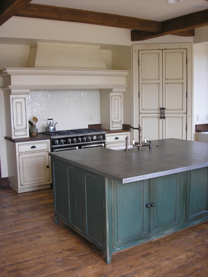
2. Pewter Countertop – Another feature in the kitchen, the pewter countertop on
one of two islands may have been my favorite thing. I looooved the way it looked. You can tell it’s a metal but it is so matte that it almost could pass as a dark concrete. The countertop at the house was slightly hammered, but I imagine it could be smoother or more dented depending on your taste. Pewter is an alloy (like white bronze) that is fairly soft and will show some of the dents that will inevitably happen in a kitchen. But you could mask some of those by having it hammered on purpose. I don’t think I would mind the dents – give it some personality to make it seem more antique and genuine.
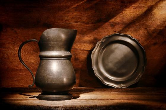
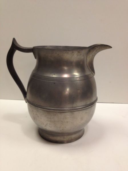
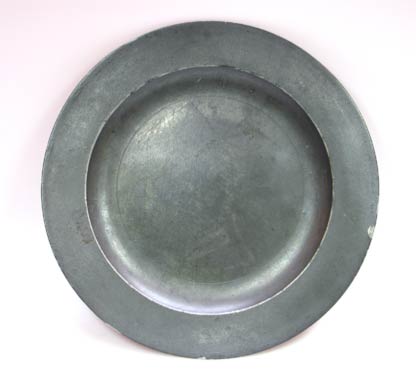
3. Pewter accessories – Before I even got to the kitchen, I noticed how many designers used pewter platters and pitchers in their designs. My mom has an old pewter pitcher and I have always admired how it looked. It effortlessly gives the feel of an antique, and you could imagine it anywhere from an old farmhouse to a vineyard estate. Many rooms had pewter plates displayed up on the wall. I think I’m going to hit a few second-hand stores with these in mind.
4. Paint colors – Here are a few that caught my eye:
Benjamin Moore Collingwood – This was used in a huge space downstairs and it felt just right. Light and airy, but a great tone. “Beige” can just be so yellow or so pink. I thought this one was a perfect linen shade.
Benjamin Moore Pacific Sea Teal – This dark, intense color was used in a small bathroom. It’s a lot of color so it was well placed in a little space.
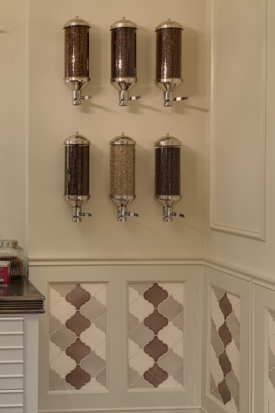
5. An espresso room – Designed by The Consulting House, this was one of the highlights of the house for me. In fact, on the floor plan the homeowner switched the espresso bar and the wine cellar so that the espresso room had more square footage. As a recent transplant from Seattle, I thought it was a great move. Good coffee is hard to find in Atlanta, so I appreciated this emphasis. The room wasn’t exactly my style but there were a few things in it I did like, such as the Moroccan tile on the bottom half of the wall, wall mounted coffee dispensers, and a picture of St. Peters Cathedral.
Interestingly, they featured emerald green at the entrance of the house as an homage to Pantone’s color of the year, but I only saw it a few more times in the entire house. A few dining chairs and a tufted ottoman, but no window treatments or pillows or bedding that I remember.
Thank you to my sweet husband for letting me have such an indulgent afternoon of walking around looking at beautiful things. Next year I’ll save up and make him come with me.
